Events > Artist Talk/Lecture
24 Oct. - 29 Nov. 2014
The Domestic Scene: Nicholas Gottlund
Two Exhibitions and a Public ConversationNicholas Gottlund Exhibit at Working Title Shop
Opening: Fri. Oct. 24, 7 – 10 pm.
Running through Nov. 24, 2014
Working Title Shop
126A Davenport Rd., Toronto
Nicholas Gottlund in conversation.
Saturday, October 25, 4 – 7 pm.
Art Metropole ,
1490 Dundas St. W., Toronto
Gottlund Verlag Window Exhibit
November 1 – 29, 2014.
Art Metropole Window ,
1490 Dundas St. W., Toronto
Art Metropole in collaboration with Working Title Shop is pleased to present two Window Exhibitions and a public conversation with Nicholas Gottlund of Gottlund Verlag.
The show, public conversation and window exhibit will offer a first point of contact with Nicholas Gottlund’s practices as both an artist and a publisher to a Toronto public, whereby the three formats will manifest as links between these two practices.
Art Metropole gratefully acknowledges support from the Canada Council for the Arts for this project.
From a converstion with Nicholas Gottlund:
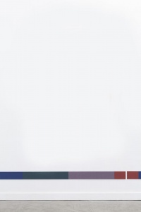
AJ: What materials did you use to create the Spanners? NG: Strictly speaking they are book cloth glued to and wrapped around a thin aluminum bar. I used a strip of magnetic tape on the back to place them on the wall so they can be easily installed and arranged. The cloth I use is a single type manufactured in France from viscose rayon. It’s dyed in various colors, all of which seem slightly “off”. The colors seem to belong to an idiosyncratic system – adjusted and tweaked to just the tint or shade by an anonymous author. AJ: How do the Spanners relate to your work as a bookmaker? NG: The process of wrapping and gluing the cloth is pretty much the same method as when I make a hard cover book by hand. The only difference is that on the Spanners there are multiple pieces of cloth that butt into one another. Where the different pieces (colors) meet there is not a seam. They are not sewn, but glued down. This makes the cutting of the cloth very critical. It has to be precise. This level of detail is something you become tuned into after spending a long time working at any craft or task involving the eye and the hand. Cutting the cloth completely parallel to the warp or weft threads is almost impossible for me. I still try. What happens often is that when those two colors of cloth meet and one or the other is cut at on slight bias you see that run off or a series of little white tips of the underlying thread which read as a series of dots. It isn’t until you get very close that you notice this. I take satisfaction in knowing that despite my best efforts, there will be something in that junction of color that I didn’t expect. AJ: Are the Spanners made for multiple arrangements or installations? NG: Yeah, however at this point I only see them running horizontally approximately 24” off of the floor. There may be one or many installed depending on the length of the wall. They may touch end to end at times, again depending on the scale of the space. The Spanners exist on the surface of the wall in a way that is formally similar to the way in which a color or control bar sits on the surface of a printed sheet of paper. Lying in the margin, low on the wall, they occupy a space not out of view but often not considered. This placement allows for other works to be hung above them as well as for the accommodation of architectural elements such as windows. The colors in each of the individual Spanners are set up in a way so that they can be read from left to right or from right to left. The colors at the end of each piece may be imagined to bleed off the edge and run into a non-printed space. AJ: Are there relationships to time and architecture in both the Spanners and the prints? NG: The color bars on a piece of printing are usually trimmed off. They exist only for the printer within the timeline of the production process. The margin of architecture on the other hand never gets trimmed off, rather it often gets covered over by various materials designed to span the transition in surfaces. If we can expand this idea of treating the wall like the page and connect it more broadly to the notion of a focal point versus the periphery then by hanging something so low on the wall in addition to something that is centered to the height of the eye, all points have been given equal weight and value. Both the periphery and the focus can be anywhere. If we consider not only the interior space of the room, but also the overall environment such as what is visible through the window(s), then the Spanner or color bar can also be seen as a constant in light of a changing exterior. In this way they address repetition and time very directly.Images
1: Nicholas Gottlund, Spanner 1, 2014, installation photo.
2: Nicholas Gottlund, The Domestic Scene poster designs. Nicholas Gottlund.


