Shop > Artists' Books
#13196
IKREK - ponto e vírgula (semi-colon): Set of 7 Books
IKREK- Price
- $180.00
- Date
- 2017
- Publisher
- IKREK
- Format
- Artists' Books
- Size
- 15.5 × 23 cm
- Length
- 128 pages
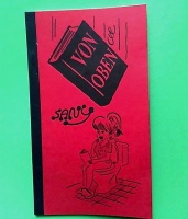
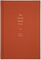
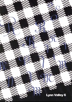
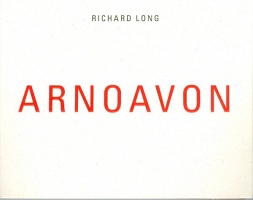
The ponto e vírgula (semi-colon) series was created by the Brazilian publishing house IKREK as an exploration of the possibility of the book as a support for contemporary art production. The books comprising the series have a standard format; each invited artist is asked to conceive a work within this format. The works in this series consider the book at its most conventional – as a vehicle for literature – and imagine new possibilities within the limitations of the form.
All publications are in in Portuguese.
Publication Specifications:
23 × 15.5cm
128-page book
printed on eurobulk paper, in special color,
protected within a rigid glove with colorplus paper lining, using screen printing technique.
Edition of 300
Four works are scheduled to be released every year. The printing is limited to three hundred numbered copies. This collection includes the following 7 issues:
Não
Fabio Morais
2014
Fabio Morais, for whom the book as a support is the starting point for his artistic explorations, was invited to premiere the series. In a study regarding the history of printing (and of artistic expression) in Brazil, Fabio writes books, gathers references and produces dialogues which cover the theme since the eighteenth century – from the possible arrival of printing companies in the country, and the subsequent prohibition of their existence, up to the authorization for them to operate granted in 1808, as a result of the transfer of the Portuguese royalty to the country – to the censorship period established by the military in the 1964 coup, and to the 2000s, time during which it became evident the instantaneous exchange of ideas and information of the new means of communication.
Fabio starts his work by inverting the physical, traditional arrangement of the book itself: the text commences on the cover, occupies some of its unnumbered central pages, in order to make room for imagery. This imagery constitutes a dialogue in itself: to follow it, the reader should go “back and forth” throughout the book, since the pages have been shuffled. Near the end of this exercise one reaches what would be the book cover, on a central double page, including the answer to the last question of the dialogue: No. Once the dialogue is finished, the text is resumed, to end then on the back cover.
vinte e cinco
Rafael RG
2014
Two are the sources used by Rafael RG in the elaboration of his works: documents and affective memories. The blending of the latter two results in works that resemble fiction. This is so due to the deployment of documents carefully selected in institutional or personal archives in combination with narratives which always have the artist, or his alter ego, as one of the characters.
On combining his own memories with those of artists who had a great influence on his artistic education (Ivo Mesquita, Paulo Monteiro, and Rochelle Costi), in addition to documents which make reference to compiled information, Rafael RG builds a truthful record of experiences that permeate the 25-year-old lives of each of those characters and leaves the story unfinished – or on a blank page – about what took place, what takes place, and what will take place subsequent to this age he considers crucial, owing to a quotation left by the Colombian poet, Andrés Calcedo: Es uma vergüenza vivir más de 25 años en este mundo (“One should be ashamed for living beyond 25”).
The interviews, performed within almost two years, do not seek to reach an end to the stories; for this reason, perhaps, they may even end abruptly. Rafael RG’s speech emerges from the background hues and is dyed in the same tone of the collected information pieces – the purplish reports, documents and memories -, and typography using size 25, and his speech is interlocked with those fonts and that number, which is also present in all pages of the book. At the end, the letter written to the one who inspired the work of the artist seems to free him from the digits, memories and shame for his age, thus resulting in pages to be filled out.
o que une – separa
Lenora de Barros
2014
The book of Leonora de Barros is the outcome of a poetic investigation based on the hyphen, its shape and meaning, once she sees the book as an autonomous and acting object, both due to the possibility of recording an act, or due to the fact that its own handling, and its own reading, is a performance in itself.
The mark, which is the most essential part of the work, depending on its use, unites or separates anything that tries to approach it. The journey between a black notepad, the book, until a symbol and its uses, the hyphen, is affected herein by a subtle noise: the presence of the artist herself, who gives life to it.
A varnish layer unites and separates the geometrical rectangular shape – typical of the hyphen and book – from the photographic record of a performance involving the work of Leonora, and a banner installed on the facade of Cento Universitário Maria Antônia which is subsequently mutilated. This has nothing to do with a piece of information, i.e. true or false, but rather with ponderations on who is seeking and who is being sought after, on a shape that is received and another that is built. What does bond the audience to the artistic object, and what distances the latter from the former? What does unite people living on different continents, and what does segregate them? What does bond shape to content, and what separates them? Are there influencers?
This is a work than can be enjoyed in various ways. In the most obvious one the reading reveals the title of the book: what unites – also separates. However, if we see it from the perspective of a verbal code investigation, as a poetic construction, when we read the particle if, almost imperceptible in the core of the book, without paying close attention, obviously, to grammar rules, and also creating stops or different intonations while reading it aloud, even when they are not present in the book by means of adequate symbols, the work makes us question the particle lexicon: what unites also separates, and may be read in various ways.
Atletas: 1988-2014
Jac Leirner
2014
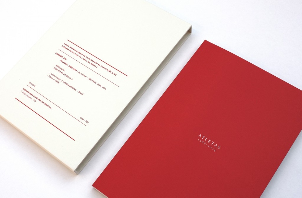
The artist book _ Atletas 1988-2014_ authored by Jac Leirner specially for the series Ponto e vírgula (Semi-colon), and published by Ikrek Edições, is the consequent development of the work performed based on the collection of athlete imagery and its corresponding captions released on Brazilian and foreign newspaper pages which Jac has been compiling since 1988. The set comprising these newspaper cuttings resulted in drawings and collages in the 80’s and 90’s, and works on steel which were shown for the very first time at the Hardware Seda – Hardware Silk exhibit, at the Yale School of Art, in 2012.
Using everyday memorabilia has become a constant feature of Jac’s work. This fact should be taken into account when reading this specific one, since the headlines that have been selected, as a result of the daily reading of newspapers, give a snapshot of the sports events that were under the spotlight at the time, and also map places visited by Jac Leirner.
The book depicts a narrative that is neither linear nor contextualized, although extremely dramatic. This effect is reached by means of three central ideas conceived by the artist: the absence of the human being figure depicted on the photos, but present in the contours the latter suggest; the prominence given to captions; and, finally, the color that was assigned to the content: blood-red.
Reference to newspaper dates and names are left to the table of contents that can be found at the end of the book; therefore, neither the reading nor the attention that should be given to the figure contours gets distracted. This book displays texts in various languages, it is thus not limited to a Portuguese-speaking audience.
The book production process is quite particular: the artist drew, in pencil, the contours on hundreds of newspaper cuttings. Newspapers and drawings were pre-selected based on the parameter of the absence of human profiles that could be clearly distinguished, i.e. the more abstract the contour, the better. Those contours were subsequently scanned and placed on graphs; captions were treated in such a manner so as to preserve the newspapers font families and the format in which they were published. At last, the contours which would appear in the publication were chosen.
